Let's Work Together
Questions & Comments
Thank you! Your submission has been received!
Oops! Something went wrong while submitting the form.
.png)
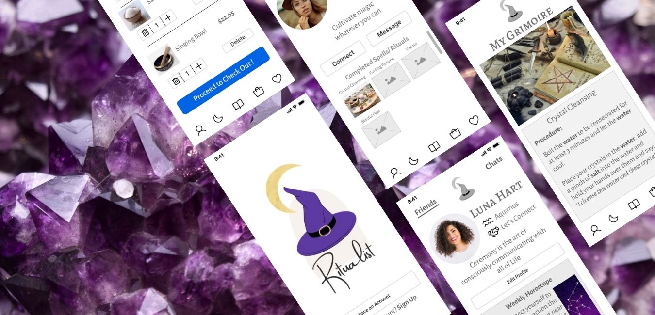
Ritualist is a spiritual witchcraft app which I created as part of Thinkful’s UX/UI Course. It is created to help facilitate connection and community amongst like-minded conscious thinkers and believers using spells and rituals used to promote health, wellness and emotional/ spiritual self-healing.
Research
Content Strategy
Design
Brand & Identity
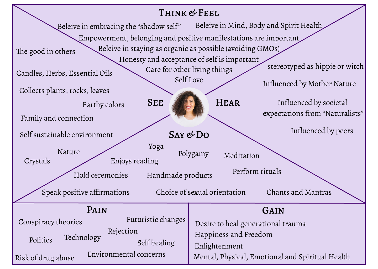
Empathy Map
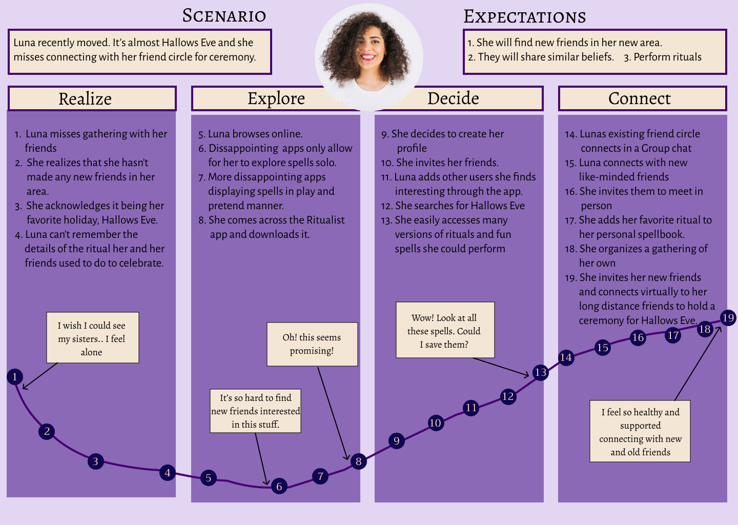
User Journey
Personas
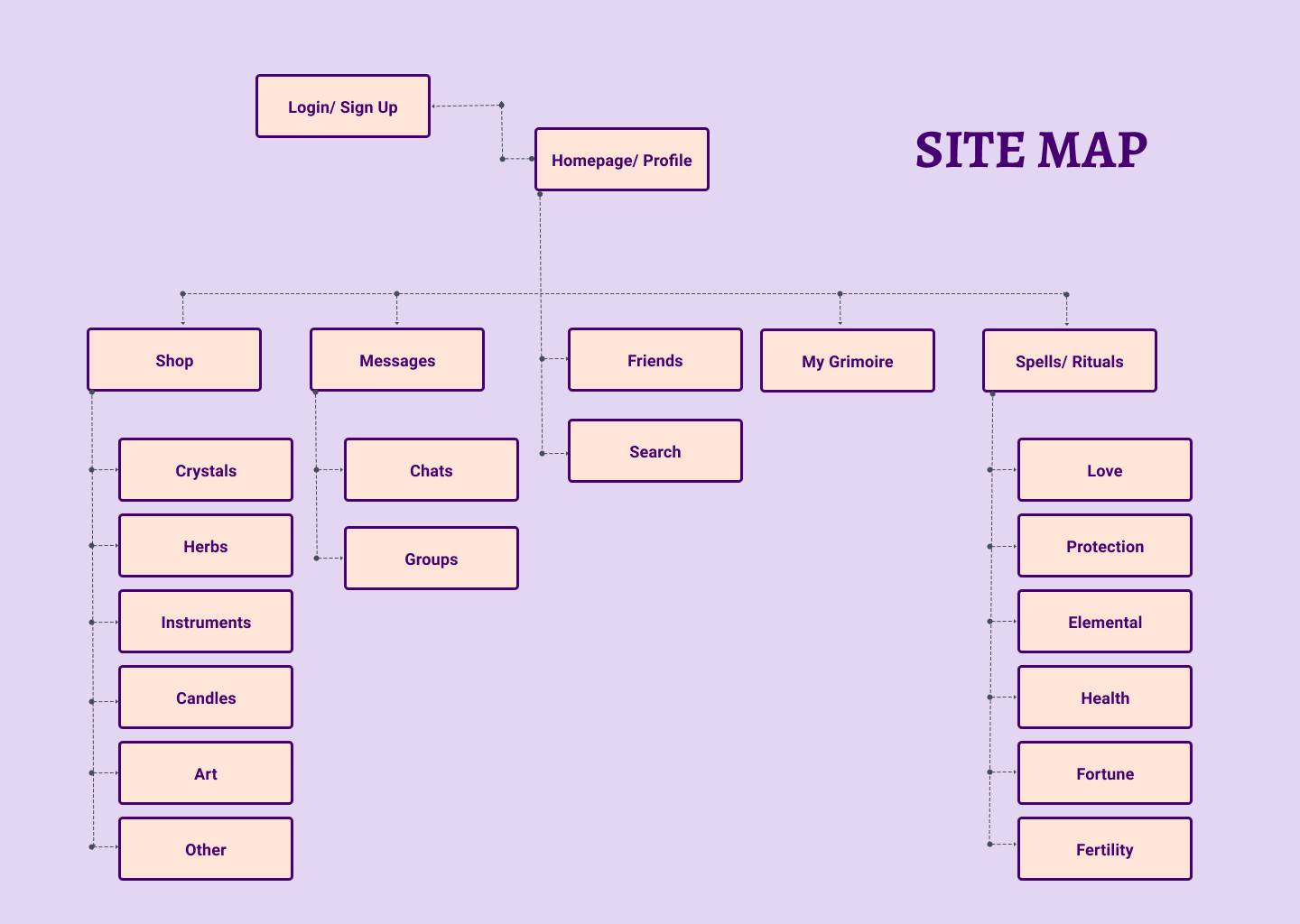
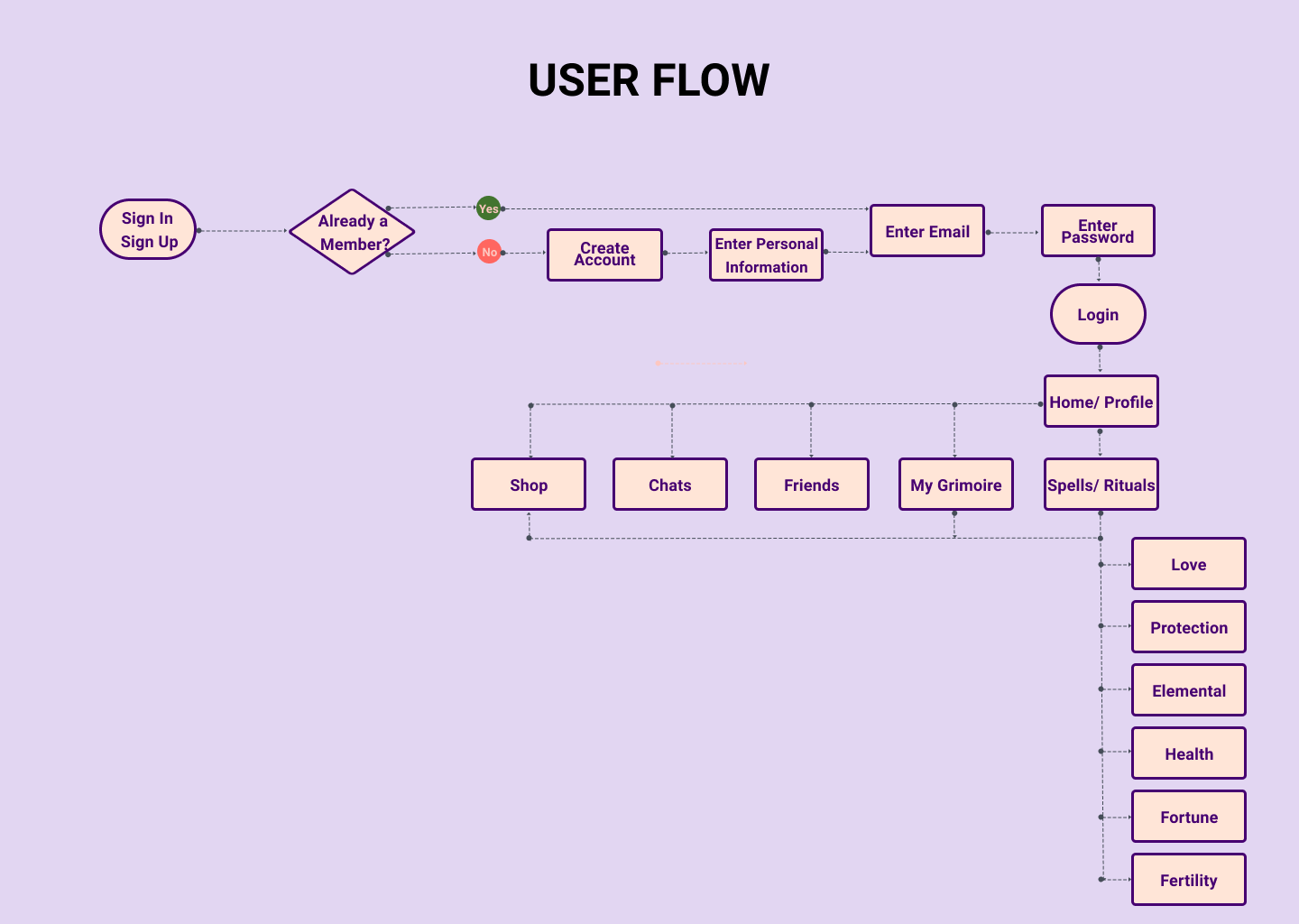
Site Map
User Flows
Competitive Analysis
User Surveys
User Stories
Sketches
Storyboard
Content Strategy
Wireframes
User Tests
Style Guide
Hi-Fi Prototype
Figma
Google Forms
Canva
Miro
Although similar communities have existed throughout history, this holistic and witchycommunity is growing here in the US and there are minimal tools online to support it.
This community is oftentimes not taken seriously, and the existing magic apps do notallow for socializing with other like-minded individuals. They present magic andspells as a play tool rather than a spiritual belief system.
Mainly 18-35 year old users who believe in magic and the art of self healing and positive growth using spiritual practices, intentions and manifestations.
Our Team created an app that promotes magic in a positive and spiritual way, that allows for community building through connection using spells and rituals and similar belief systems. Additionally, the app provides a convenient space for shopping and supply gathering and brings it all together in an operable, consistent and aesthetically engaging manner.
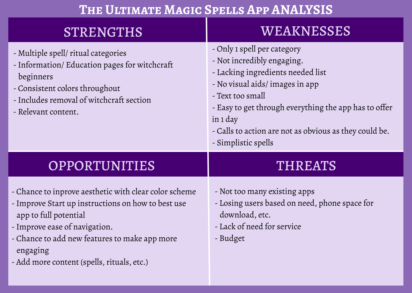
Competitor Analysis 1: The Ultimate Magic Spells App - Provides multiple spells and rituals and ample information and education pages for witchcraft beginners. App is not incredibly engaging. There are no visual aids nor images used throughout the entire app and the calls to action are not as obvious as they could be. We have the opportunity to improve this by adding additional user engagement features, images and visual aesthetics.
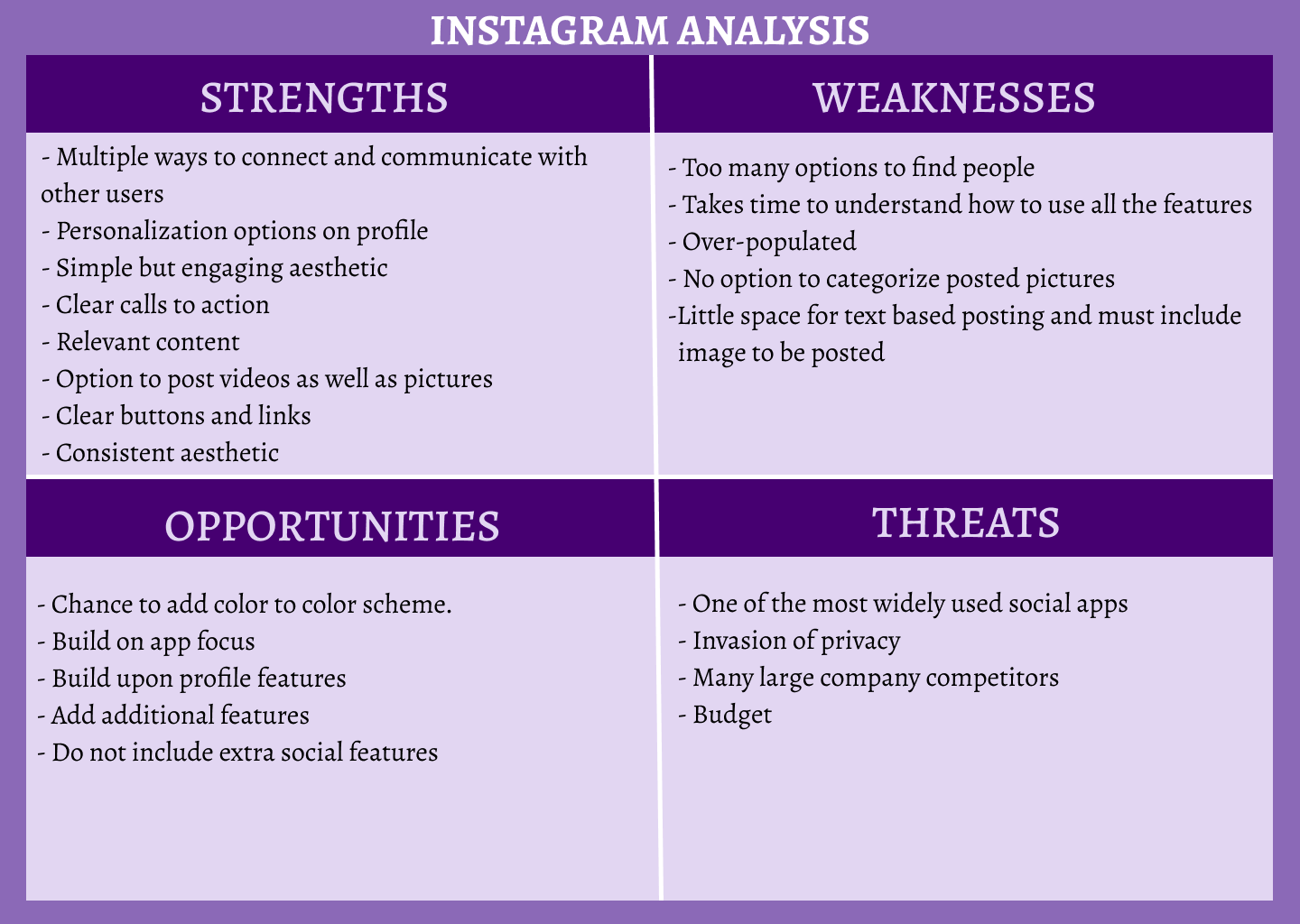
Competitor Analysis 2: Instagram - The app has interesting profile personalization options, an engaging layout and very clear calls to action. It includes too many features though which take time to explore and understand how to use. Instagram is also not tailored to a specific community which is an area for improvement in our own product which is focused on the purpose of linking like-minded individuals in the witchy/ spiritual Community.
User Survey: I conducted a user survey with 13 potential users in combination with 2interviews to collect both quantitative and qualitative data to validate the need for Ritualist’s service and community interest. The target audience was any individual who considers themselves to be spiritual.
.png)
.png)
Shockingly, we also found that 69.2% of survey participants believe in magic, that 100%do not currently use any metaphysical promoting mobile app and that 69.2% feel that society’s portrayal of witches and magic is not fair nor accurate. This finding backed our original theory of a new type of magic app being in need on the market.
.png)
.png)
Lastly, Our User survey uncovered that a large majority of our participants practice their spirituality through prayer, rituals and ceremony. Furthermore, they use Crystals/ Gems, Candles, Herbs, Essential Oils and Instruments as tools most often. These findings helped us to determine which items to include in spells and rituals directory and shop categories which you will see below in our site map and user flow.
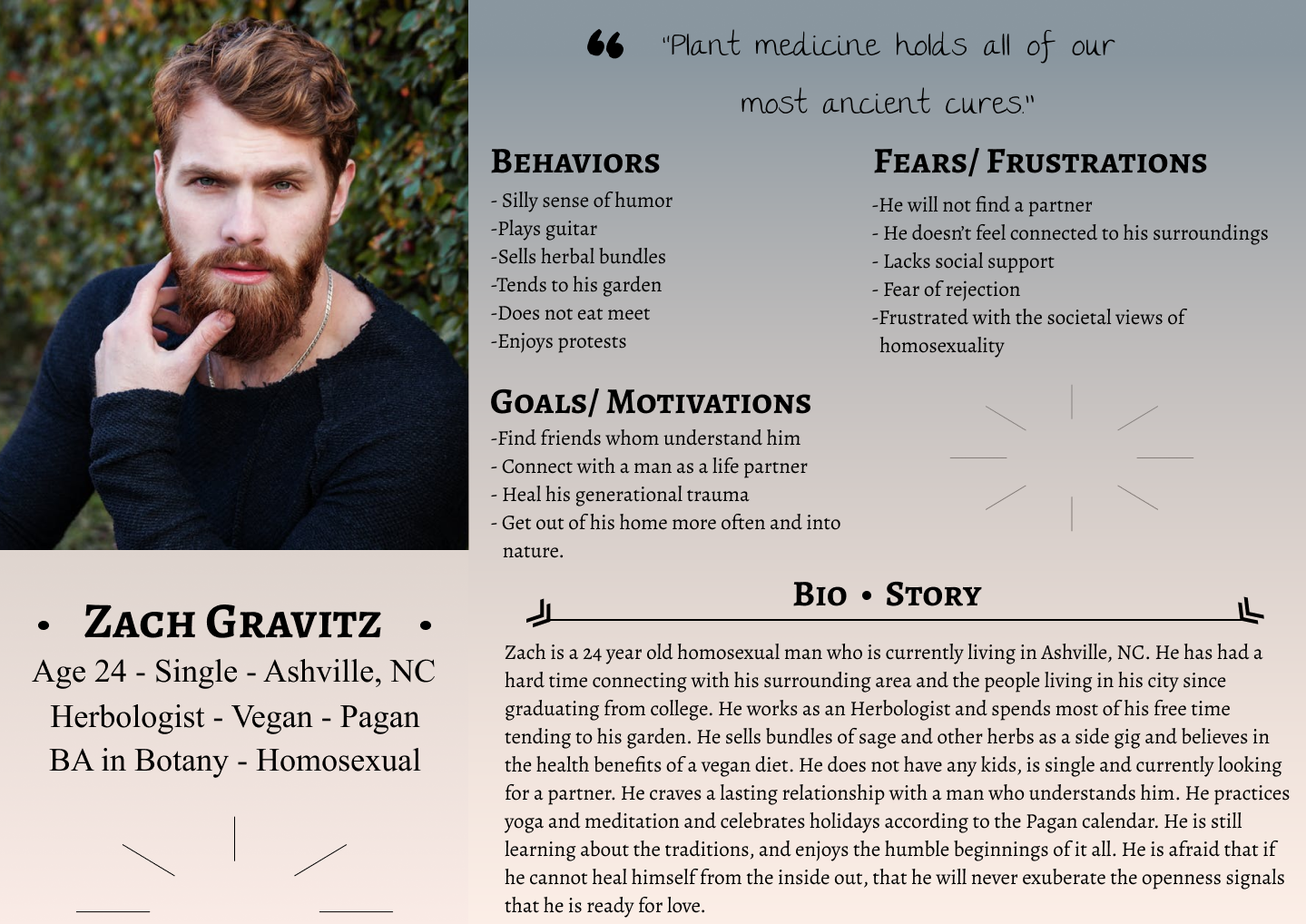
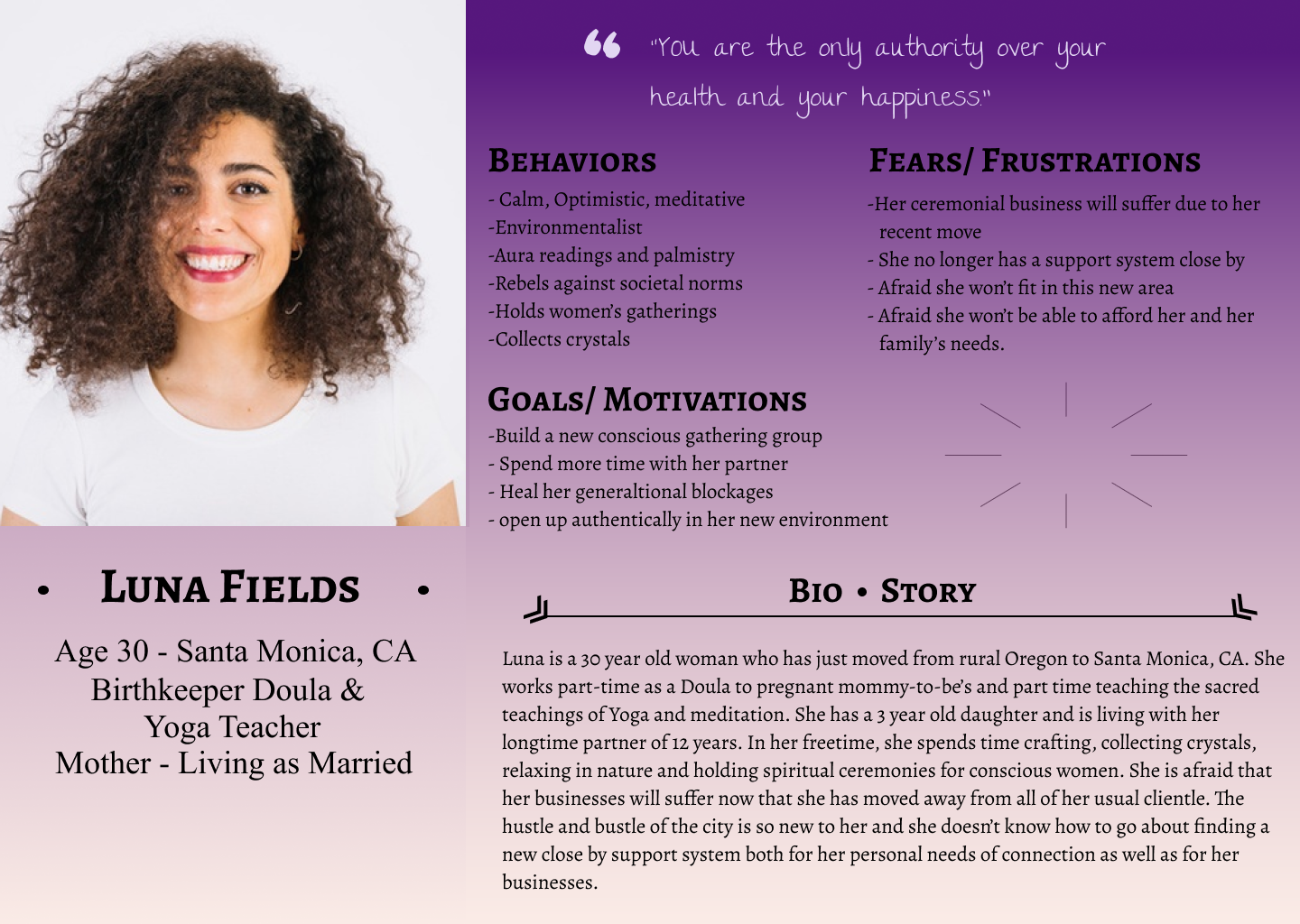
Based on user survey results, I created 2 user personas to guide design decisions, priorities and develop empathy with potential users.
.png)
.png)
.png)
.png)
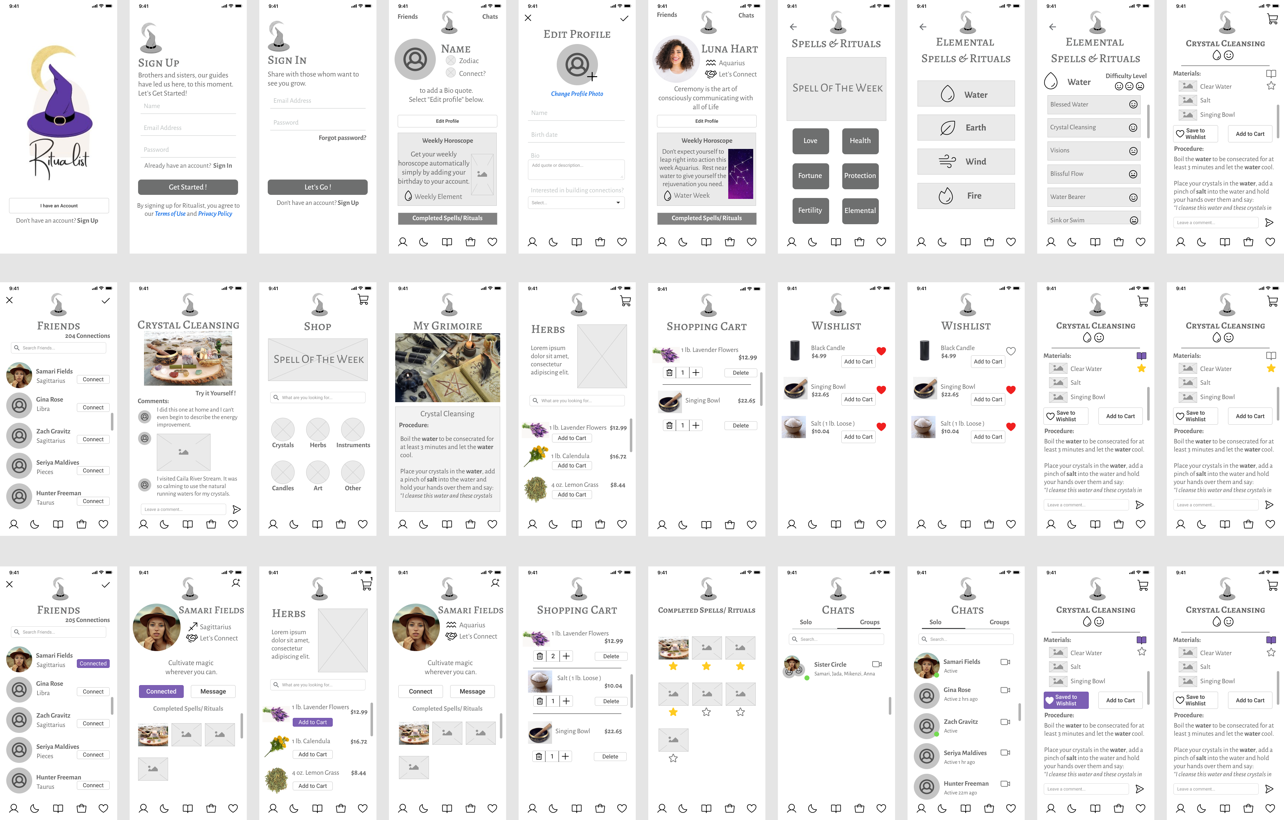
I conducted virtual interviews with 4 participants using a set scenario including 5 tasks, each of which testing a different area of our app.
Task 1 tested our onboarding experience by asking our participants to create an account.
Task 2 tackled the profile by asking participants to set up their in app presence for other users to see.
Task 3 tested our Connections flow by asking our participants to add a friend to their page and then check out their profile.
Task 4 tested the navigation and flow by asking participants to look up a ritual and add it to their grimoire.
Task 5 tested the shopping feature asking participants what how they would add spell materials to their Wishlist.
**Key Findings & Iteration Improvements
Positive:
+ Movement through the onboarding section was pretty seamless for interview participants.
+ Movement through the editing profile process appeared easy once “edit profile” button was found.
+ 4/4 participants liked the shop feature.
Negative:
- Observed boredom at Home profile with 2 participants.
- 4/4 participants commented on the placement and/or difficult noticeability of the “Friends” button at top of page.
- ¾ participants mentioned difficulty in differentiating which Completed spell piece to click on or how to tell which posting would be which spell.
.png)
.png)
.png)
.png)
1. Review, Organize and Outline all research, notes, deliverables, sketches, wireframes, etc.
2. Explore alternate personas and possible user journey's not yet included and create them if plausible.
3. Determine branding and incorporate imagery.
4. Create High-Fidelity Prototype.
5. Test Hi-Fi Prototype with users and gather feedback on both functionality as well as aesthetic.
6. Determine what it would take to code, test and launch product. Consult a development professional if there is not one already on the team.
7. Present findings and build plan to Stakeholder and Client for approval to continue to development stage.
8. Hire development team
9. Launch!
At the end of the design sprint, we felt we had 5 main accomplishments!
1. Created an app that doesn't make a joke out of spells and rituals but rather approaches the belief system in a spiritual way.
2. Allowed for connection and community building within the app.
3. Created convenience for shopping and supply gathering.
4. Focused on positive spells and rituals used for love and light.
5. Brought it altogether in an operable, consistent and aesthetically pleasing and engaging manner!
The entire process was quite chaotic, but in time, each step of the process came together nicely. During the stakeholder and client presentations, I learned of a few more areas that could still be improved upon. The first being the flow and order in certain parts of the slide deck, and the second was in an iteration improvement where I added a hover action for a mobile app… think about that. Mobile applications, such as on an iphone, are generally touch-screen. There are no hover actions! This is something that will need to be touched upon once we dive into the typography and branding. These links need some other ways of differentiation from regular body text and headings.
Let's Work Together
Email : AYSUMMY@GMAIL.COM

.png)
.png)